Our new visual identity
Over the past few years, we have continued to deepen West Coast LEAF’s work to advance justice and equality for all women and people who experience gender-based discrimination.
Our work is rooted in relationship-building and sustained community engagement. In all we do, we center the people most impacted and marginalized by systems of injustice and oppression, including those harmed by colonization, patriarchy, racism, and ableism.
These ways of working bring us further into alignment with our commitment to work for the full realization of the rights of Indigenous peoples and the Nations of these lands.
To bring these values to life, we’re incredibly excited to share our new logo and visual identity.
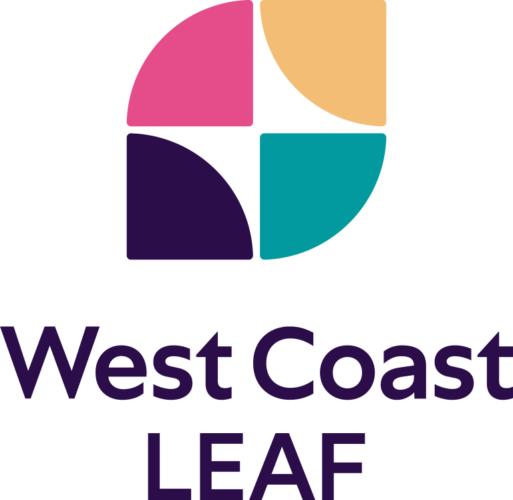
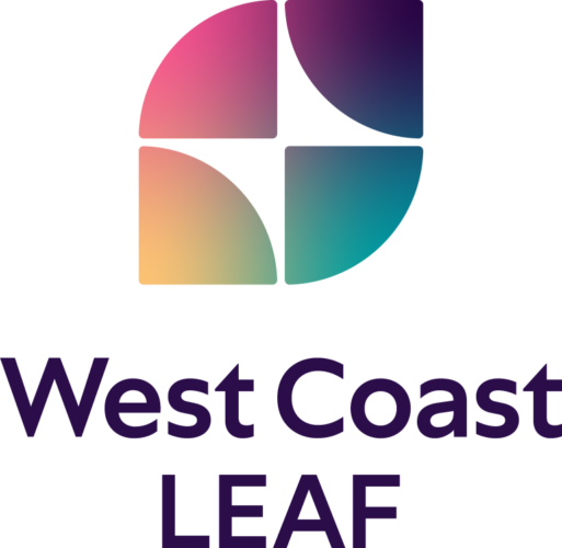
Our new logo reflects our values of justice, accountability, safety, and relationality, and how they make it into the work we do.
The shapes in our logo evoke the diverse communities for whom we advocate. Taken together, the shapes represent the wholeness of our organization, incomplete without its parts.
At first, you may observe a traditional leaf shape, but in the white space a butterfly emerges—a representation of our transformative impact on critical issues of equality and justice, but also of our transforming organization.
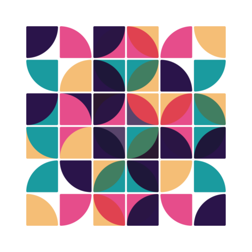
When the symbol is repeated, the shapes combine into a quilt-like pattern.
Like the people of West Coast LEAF and the communities we serve, the logo is meaningful as a single unit, but it’s also part of a collaborative system. The intersecting pieces combine to make the whole strong.
Finally, the use of a colour gradient signals continuity and endless possibility—fluidity, rather than rigidity and binaries.
We’re proud that our new logo tells our story of change, intersectionality, and strength in community.
Thank you to Nancy Wu Design for helping us translate our values into a beautiful visual identity!